



Your email platform says 99% delivered. That number is almost entirely meaningless as a deliverability signal.
Delivered, in ESP terms, means the receiving mail server accepted the message and didn’t bounce it. Once the message crosses that handoff, your ESP has zero visibility into what happens next. Gmail can accept your email and route it directly to spam. Yahoo can accept it and drop it in junk. Klaviyo, Mailchimp, and Omnisend have no visibility into where it ended up, because that decision happens inside the mailbox provider’s infrastructure after the handoff.
So when someone asks how to check whether their emails are landing in spam, the honest answer is: you can’t find out from your ESP dashboard. You need a tool that has eyes inside the inbox.
One pattern that shows up consistently across senders who start monitoring for the first time: a significant share have at least one mailbox provider, usually Gmail, where spam placement is materially higher than the others, and they had no idea because their overall open rate looked normal. The problem was always there. It just wasn’t visible.
Why Open Rate Can’t Answer This Either
Most eCommerce teams fall back on open rate as a proxy for inbox placement. If people are opening, it must have landed. That logic breaks in two places.
First, Apple Mail Privacy Protection pre-loads tracking pixels for Apple Mail users, which Klaviyo and every other ESP records as an open regardless of whether the message was read or even noticed. For a list with a heavy Apple audience, a large share of reported opens are machine-triggered — why open rate is misleading covers how far the distortion goes and which metrics survive it.
Second, and more directly relevant here: the people whose mail landed in spam aren’t opening anything. Their silence is invisible in an average. A campaign with 30% of Gmail recipients in spam looks like a normal send with slightly softer opens, so you iterate on subject lines and send times chasing a problem you have never correctly identified. Inbox placement rate explained covers why it is a different metric from delivery rate, and the learn page on inbox placement rate has the formula.
So your ESP is the wrong instrument. Here is what actually works, cheapest first.
How to Know If Your Email Went to Spam
How to know if your email went to spam depends on whether you mean one message or a whole send.
One message. Ask the recipient to look in their Spam or Junk folder. If the message is there, open the source and read the Authentication-Results header. A failing SPF, DKIM or DMARC result is the most common cause, and it is the first thing to fix. The same header answers the reverse question, how to tell if email is spam when it reaches your own inbox: a message that fails authentication for the domain it claims to come from deserves suspicion.
A whole send. How to know if your emails are going to spam across a list is a placement question, and only seed mailboxes or live placement monitoring can answer it. Methods 1 to 4 below are ordered from the cheapest to the most complete.
Readers who ask why my email is going to spam are usually dealing with one of four causes: failing authentication, a complaint rate drifting toward Gmail’s 0.10% guideline, poor list quality, or a damaged sending reputation that no content change will fix. When an email landed in spam, note the provider, the date and the campaign before changing anything, so you can tell which cause you are chasing. The emails going to spam fix guide walks through the diagnosis, and why emails go to Gmail spam covers the Gmail case.
If your reaction to a bad result is “my emails land in spam”, the useful next move is to find out where, not to rewrite the copy.
Method 1: The Manual Seed Inbox Check
Cost: free. Time: about 20 minutes. Tells you: whether you have an obvious, across-the-board problem.
Before paying for anything, do this. It is crude and it is genuinely useful.
- Create or collect a test inbox at each provider that matters to your list, Gmail, Yahoo, Outlook.com, and an Apple iCloud address if a meaningful share of your subscribers use Apple Mail.
- Add them to a test segment in your ESP and include them in your next real campaign. Not a test send — a real one, from your real sending domain, through your real infrastructure. Test sends often route differently.
- After delivery, open each mailbox and record the folder: Primary, Promotions, Updates, Spam, or absent entirely. In Gmail, check every tab; landing in Promotions is not a failure, and inbox vs. promotions vs. spam covers why chasing Primary is often the wrong goal.
- In one of the received messages, open the raw source and read the
Authentication-Resultsheader. You wantspf=pass,dkim=passanddmarc=pass. Paste it into our email header analyzer, the closest free inbox analyzer for a single message, if you’d rather not parse it by eye, email header anatomy explains each field.
What this catches: authentication that is broken for everyone, a domain that is being filtered outright, a template that trips something obvious.
What it cannot catch: anything proportional. Your five mailboxes are five data points from accounts with no sending history and no engagement relationship with you. Landing in the inbox at your own Gmail address tells you very little about the 40,000 Gmail subscribers who haven’t opened anything in a year.
Method 2: What the Mailbox Providers Tell You Directly
Cost: free. Time: an hour to set up, then weekly. Tells you: how each provider currently judges your domain.
Three of the four major providers publish sender-side data, and none of them will tell you about the other two. Check all three.
Google Postmaster Tools is the authoritative source for Gmail. Read Compliance status first — pass or fail against Gmail’s bulk sender requirements — then the spam rate trend. Since 2026, Compliance status also carries a Deliverability analysis section that returns a plain-language verdict on your domain plus a recommended action, triggered by low volume, delivery failures, spam threshold breaches, low engagement, missing opt-in signals or guideline violations. That verdict is the single fastest read of whether Gmail thinks you have a problem. Setup is in the Postmaster Tools guide; what the thresholds actually trigger is in Gmail’s spam rate thresholds.
Yahoo Sender Hub runs a Complaint Feedback Loop that returns ARF-format reports whenever a Yahoo user marks your mail as spam. Yahoo publishes no numeric complaint threshold and no volume threshold, so there is no line to watch — the CFL stream itself is the signal, and a rising count is your warning. InboxEagle has no Sender Hub connection; for Yahoo and AOL it reports seed-mailbox placement instead.
Microsoft is the one people miss, because it mostly does not use a dashboard. SNDS reports IP-level reputation for Outlook, Hotmail and Live.com, but since May 2025 the more consequential signal appears in your bounce log: bulk mail failing SPF, DKIM or aligned DMARC goes to Junk first and is later rejected with 550 5.7.515. If you have never grepped your ESP’s bounce log for that code, do it now — Outlook 550 5.7.515 guide covers what it takes to pass.
Apple publishes nothing. No dashboard, no feedback loop, no reputation signal, and MPP has made open rate meaningless for that audience. For Apple Mail recipients, clicks and conversions are all you have.
The gap in all of this: none of these tools report folder placement. Postmaster tells you your spam rate; it does not tell you whether last Tuesday’s campaign landed in Primary or Promotions. That distinction is what the next two methods buy.
Method 3: Seed List Testing Before You Send
Cost: paid. Time: minutes per test. Tells you: predicted placement across a broad panel, before the campaign goes out.
A seed list is Method 2 at scale and under management — a maintained panel of addresses across providers, with sending histories that make them behave more like real mailboxes than a fresh test account does. You send the campaign to the panel, and the results come back as a placement breakdown per provider.
The advantage is timing: you learn before the send rather than after. The limitation is that seed addresses are not your subscribers. They have no purchase history with you, they have never opened your mail, and engagement-based filtering — which is most of modern filtering — treats them differently as a result. A seed test reliably catches content and authentication problems. It is a weaker predictor of the reputation-driven filtering that hits a real list. Seed list testing vs. real-world inbox monitoring covers the trade-off properly, and InboxEagle’s seed list explains our panel.
Method 4: Continuous Placement Monitoring on Live Sends
InboxEagle tracks inbox placement at the campaign level, broken down by mailbox provider. When you click into Deliverability on the dashboard for any campaign, you see four provider sections: Gmail placement, Yahoo placement, AOL placement, and Outlook placement.
Each section shows:
- Inbox %: the share of emails that reached the primary inbox
- Promotions tab %: the share that landed in the promotions tab (Gmail-specific)
- Spam %: the share that went to the spam or junk folder
Alongside that placement data, the same view shows you the full technical picture for that send: the sending domain, the sending IP address, the subject line that was used, and the timestamp when the email was received. For the authentication side, see SPF, DKIM, and DMARC.
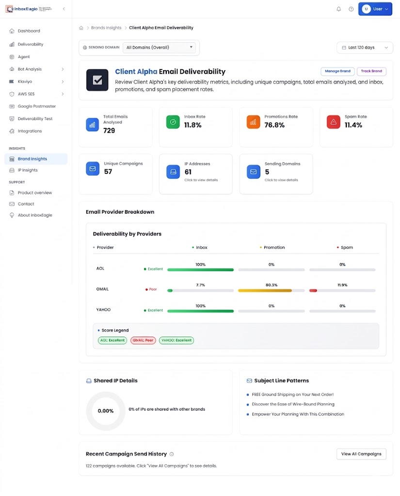
Placement outcome plus the send details is what makes the data actionable. If Gmail spam percentage is elevated, check your authentication and Postmaster data next. If both are clean, the investigation shifts to sending IP reputation or complaint rate.
Each campaign also gets an email performance score out of 100, folding placement and engagement into one number. The value is trend, not the absolute figure: if you sat at 85–90 across twelve campaigns and the last one came in at 64, something changed — even if open rate held up because MPP was inflating it.
Two things make this method different from the others. It reads every real send from your real domain and infrastructure, so you see placement per campaign rather than a one-off test. And because it runs on your live sends, it catches problems that only appear at volume — the reactivation segment that spikes complaints, the new subdomain that hasn’t warmed.
It also connects to what you already run. The Klaviyo integration puts Klaviyo’s engagement metrics next to placement outcomes for the same send; the Postmaster Tools integration pulls Gmail’s spam rate and compliance signals into the same view so you can correlate a placement drop with its cause without switching tabs; and bot detection flags the addresses inflating your open rate and your Klaviyo contact bill.
Which Method Answers Your Question
| Method | Cost | What it proves | What it can’t tell you |
|---|---|---|---|
| Manual seed check | Free, ~20 min | Authentication works; you’re not filtered outright | Anything proportional — 5 mailboxes isn’t a sample |
| Provider dashboards | Free, weekly | How Gmail, Yahoo and Microsoft each judge your domain | Folder placement; anything about Apple |
| Seed list testing | Paid, per test | Predicted placement before you send | How your real, engaged list will be treated |
| Continuous monitoring | Paid, ongoing | Where each live send landed at Gmail, Yahoo, AOL and Outlook seed mailboxes | Nothing before the send — it’s a live signal |
Most senders need the first two immediately and one of the last two once email is a material revenue channel. If you are comparing vendors for the paid options, email deliverability tools compared covers the market.
What You Typically Find When You First Connect
The findings when a brand first connects to InboxEagle follow a consistent pattern. A provider-specific placement gap where Gmail is underperforming Yahoo. A DNS or DMARC policy record change that looks fine in Klaviyo. A spam rate trending toward Gmail’s threshold without anyone noticing. Or bots inflating list size and engagement metrics.
For a full breakdown of what to look for and how to diagnose each finding, see what a deliverability dashboard should show.
Spam Checker vs. Placement Monitoring: Which Answers Your Question?
These get conflated constantly, and they answer different questions.
A spam checker analyses a draft in isolation — HTML structure, authentication headers, whether there’s an unsubscribe link, whether the copy matches known patterns — and returns a score against a rule set. Our email spam tester does exactly this, and it’s genuinely useful for catching an obvious mistake before you send. But it never delivers the message anywhere, so it cannot tell you where mail lands. It answers “is there anything wrong with this email?”
Placement monitoring reads live campaigns sent through your real infrastructure, from your real domain and IP, to your real audience. It answers “where did this actually go?” — which is a question about your reputation, not your HTML.
The distinction matters because the two fail in opposite directions. A technically perfect email sent from a damaged domain lands in spam and passes every spam checker. A sloppy template sent from a trusted domain to an engaged list lands in the inbox. If your spam checker says you’re fine and your revenue says otherwise, you have a reputation problem, and no amount of content auditing will surface it. Start with a free deliverability check on your domain to see which side of that line you’re on.
Getting Started
Do Method 1 today — it costs nothing and takes twenty minutes, and if it turns up broken authentication you have found your answer without spending anything. Set up Method 2 this week; Postmaster Tools, Sender Hub and SNDS are free and you want the history accumulating before you need it, because none of them backfill.
Move to Method 3 or 4 when email becomes a channel you can’t afford to guess about. If you are evaluating what a monitoring tool should actually surface before you buy one, what a deliverability dashboard should show sets out the criteria.
The question “are my emails landing in spam?” should have a factual answer for every campaign you send — not one inferred from open rates that may be substantially machine-generated. Every method above gets you closer to that answer. The worst option is the one most senders default to, which is assuming the ESP’s delivery rate already answered it.
If you’re an agency running this across a client roster, the monthly deliverability checklist for agencies turns the above into a repeatable review.
Note: Content created with the help of AI and human-edited and fact-checked to avoid AI hallucinations.